

cửa hàng trực tuyến
đặt dịch vụ
sự kiện
cửa sổ bật lên

- 15%
Mobile Menu Navigation Bar
Của
Sticky mobile menu and bottom navigation bar
Chưa có bài đánh giá nào
Có gói miễn phí

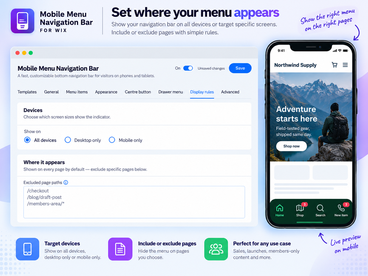
Tổng quan về Mobile Menu Navigation Bar
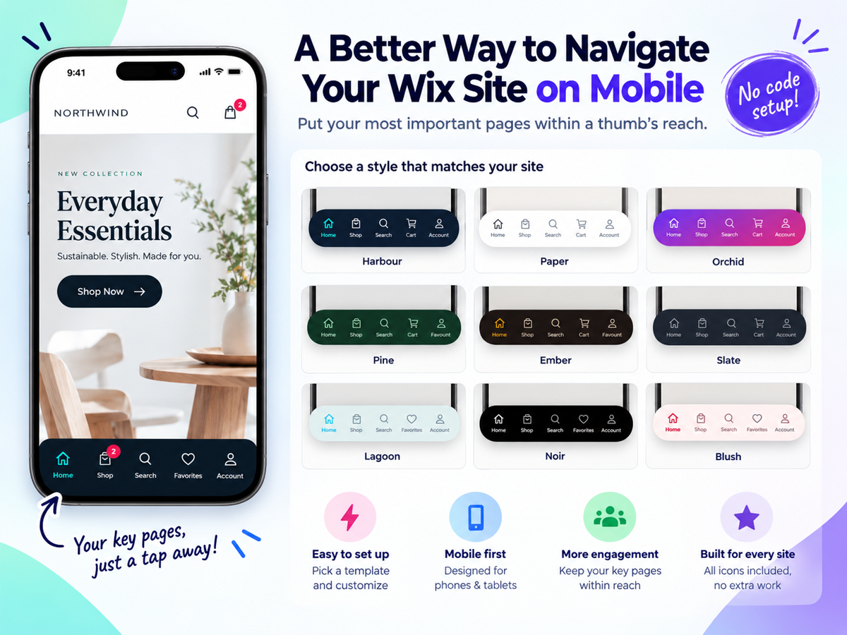
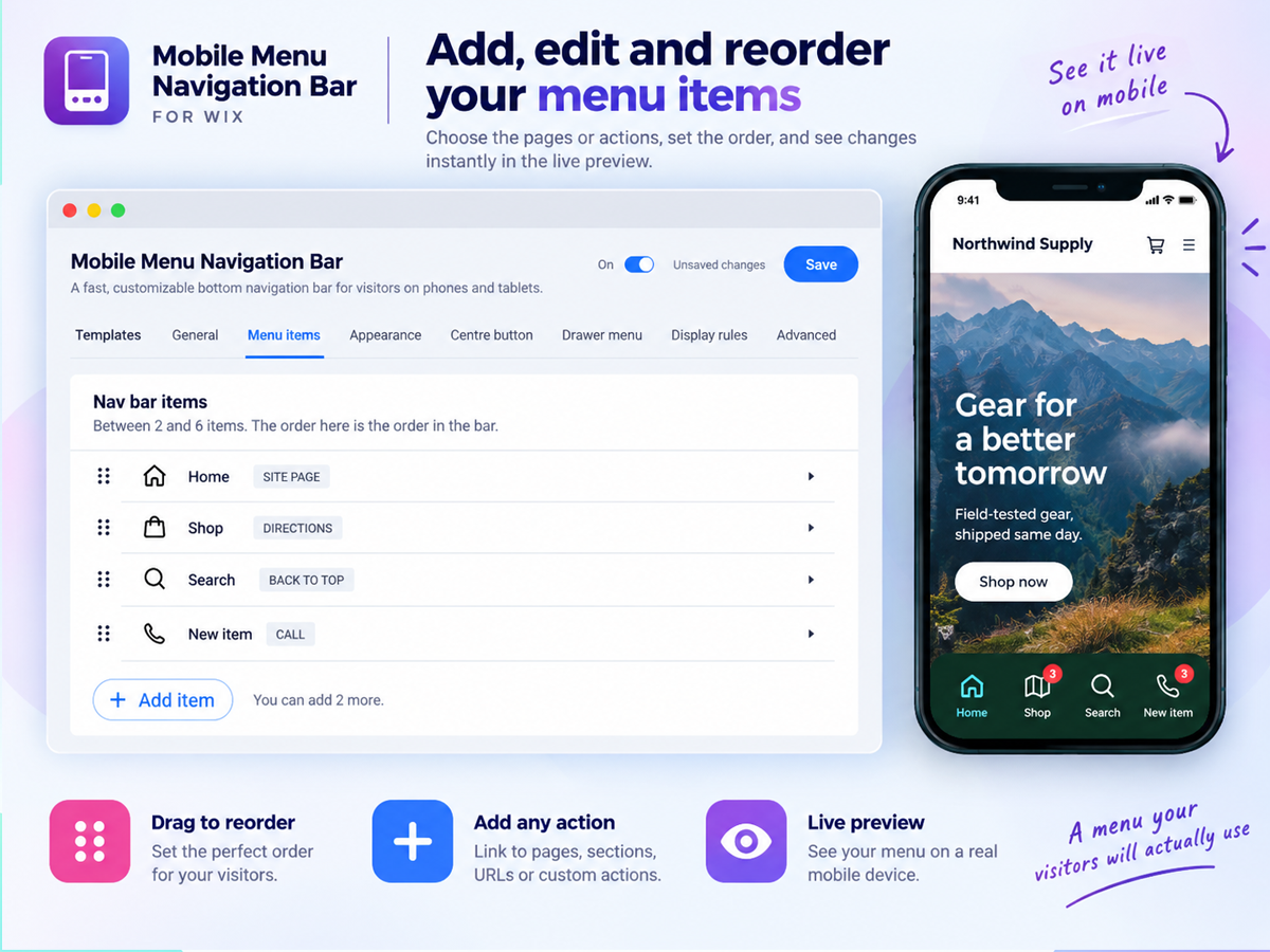
- Bottom navigation bar your visitors already know how to use: Add a sticky mobile menu bar fixed to the bottom of the screen, exactly like the apps on every phone. Choose 2 to 6 buttons for Home, Shop, Search, Cart, Account or anything else, and your most important pages stay one tap away instead of hiding behind a hamburger menu nobody opens
- Buttons that do more than link: Every button can open a page or URL, run a site search, jump to the cart with a live item count badge, log a member in, start a WhatsApp chat, place a phone call, send an email or SMS, open directions, share the current page, scroll to a section, or scroll back to the top
- A design that matches your brand, not a preset: Start from 12 ready-made looks, then make it yours: classic, floating or dock bar styles, solid, gradient or frosted glass backgrounds, 99 built-in icons across 10 categories or your own uploads, seven active indicators, custom colours, labels, sizes and corner radius, all with a live preview beside the settings
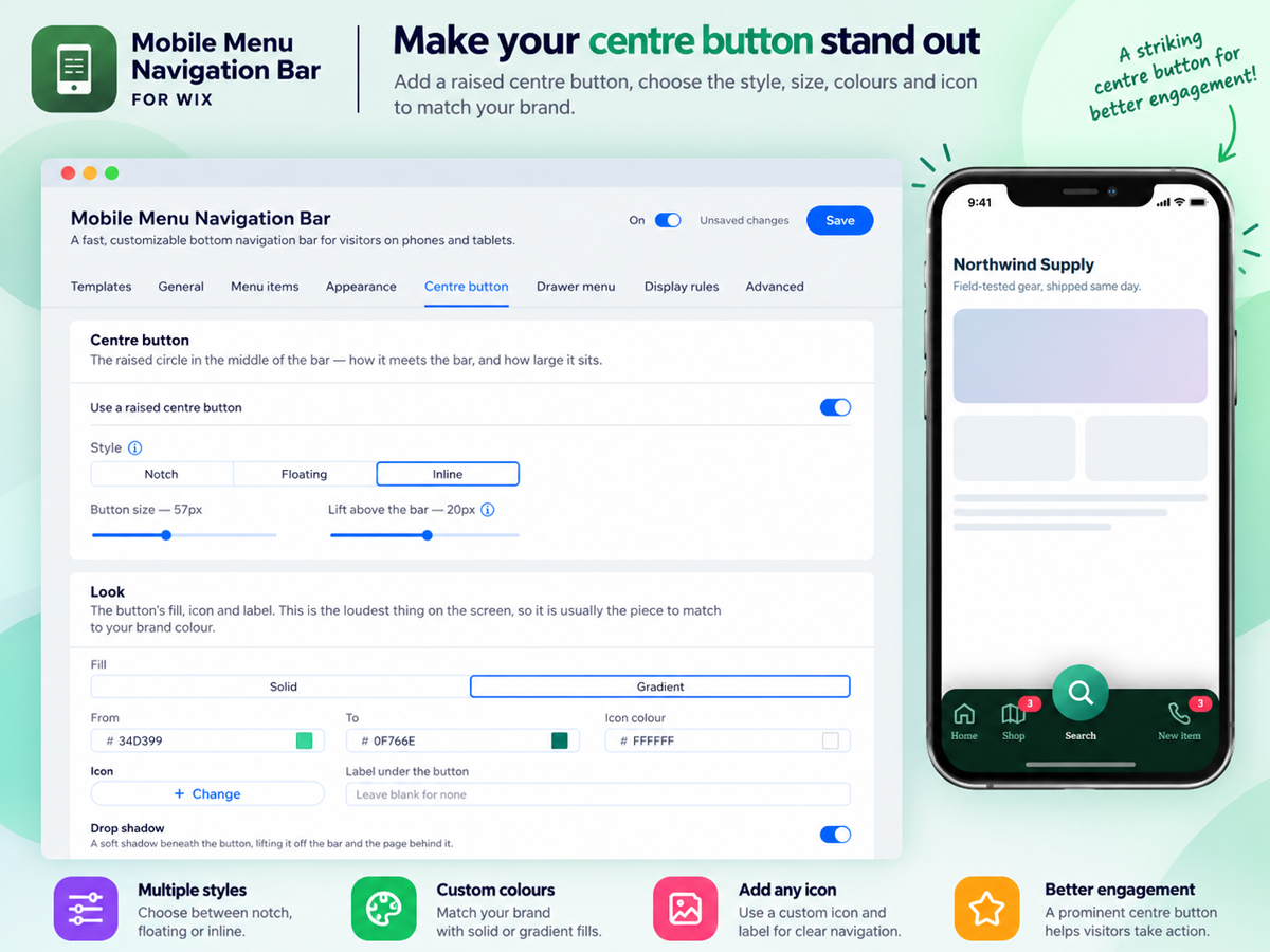
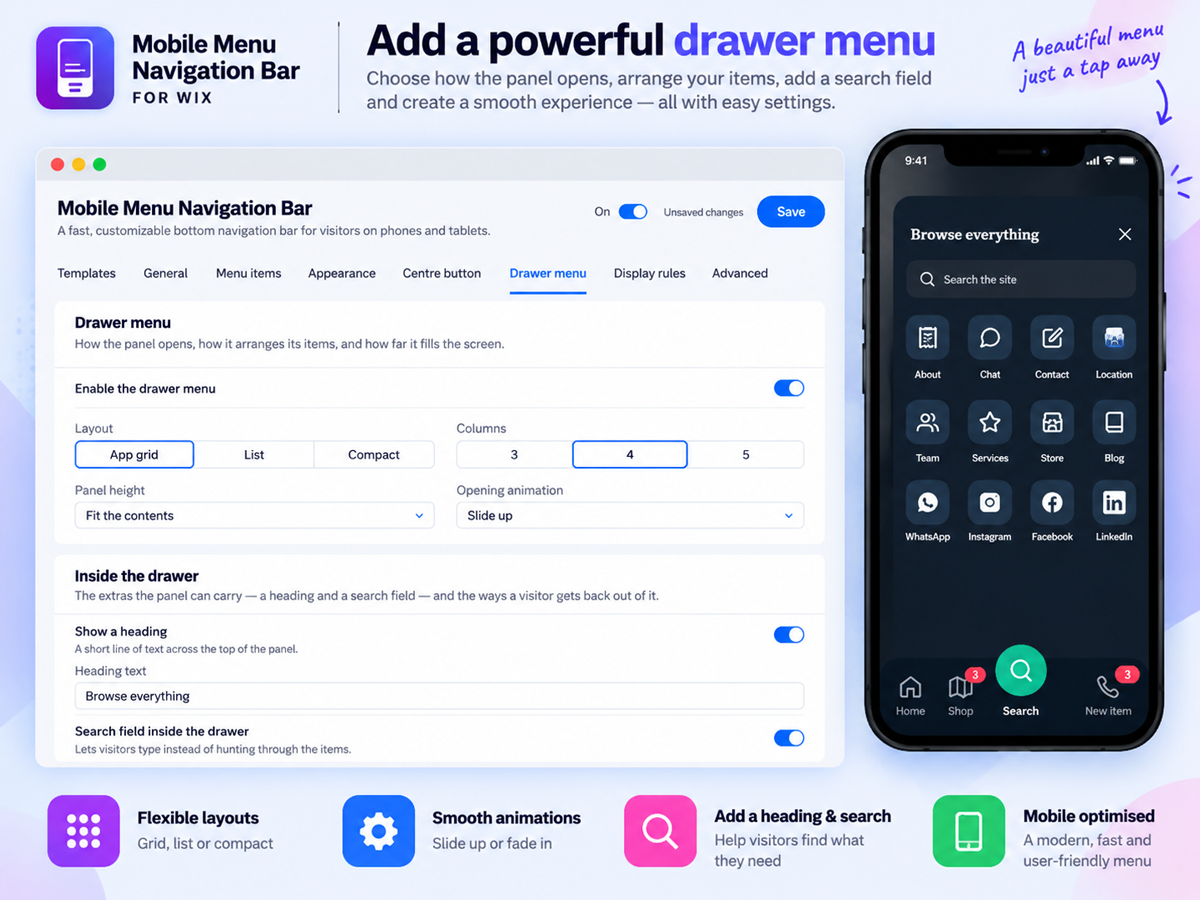
- A centre button and a full menu drawer: Raise a standout centre button above the bar and let it open a slide-up drawer holding up to 24 more links in a grid, list or compact layout, with its own search field, so your whole site stays reachable without ever crowding the bar
Xếp hạng & đánh giá
Ứng dụng này chưa nhận được bất kỳ đánh giá nào, hãy là người đầu tiên xếp hạng ứng dụng.Giá và gói
Gói Basic
Miễn phí
4 styles and 99 built-in icons
3 item selections & color selections
Navigation actions & Reset to defaults
Labels and destinations options
Gói Premium
- 15%
$
5
94
/tháng
$699
Contact, conversion actions with badge
Floating and dock styles
12 styles & gradient, glass background
Centre button & Drawer menu access
* Giá tính bằng USD.
* Ưu đãi này có hiệu lực đến 23:59 14 tháng 11, 2026 theo giờ UTC. Nhà phát triển ứng dụng có quyền kết thúc ưu đãi bất cứ lúc nào và điều khoản của chương trình có thể thay đổi.